 Mariya Design Studio
ACCOLAD · CANADA · A TWO-YEAR COLLABORATION
A brand, built
over two years.
From an initial packaging brief to identity, physical gifting, digital experiences, campaigns and a new product. A two-year design collaboration with Accolad founder Yanik Guillemette.
Logo refinement · Packaging · Brand guidelines · Digital design · Ongoing support
THE COLLABORATION AT A GLANCE
One brand.
A much wider body of work.
Identity, packaging, digital gifting, communication and product development. Each new brief built on the work before it.
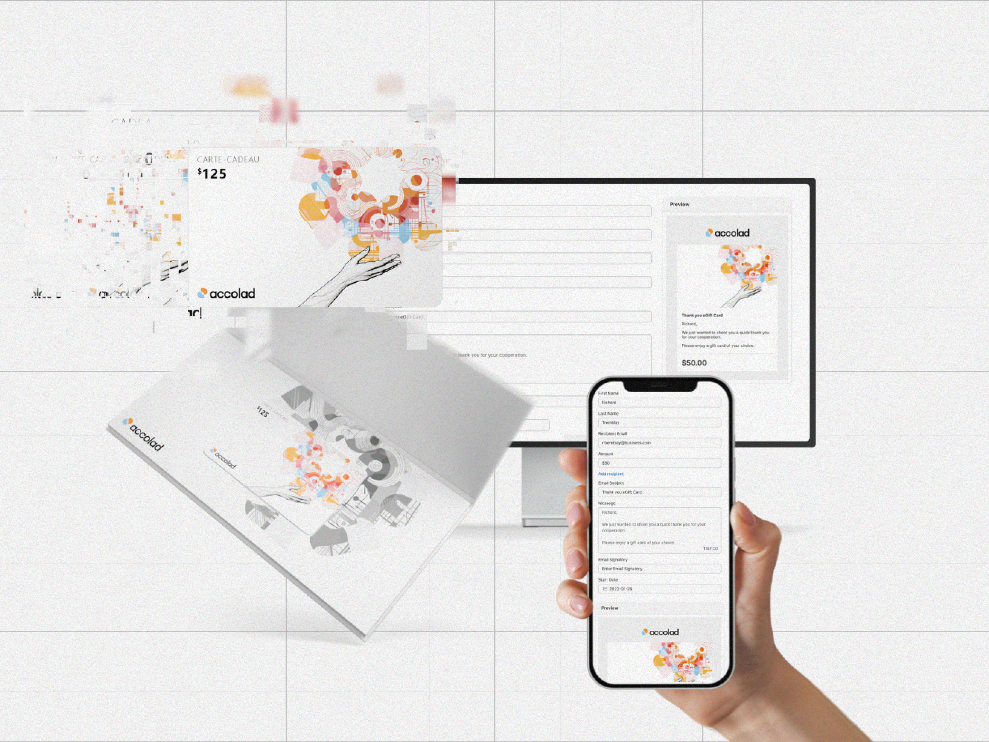
Digital + physical gifting
Gift cards, presentation packaging and self-service design
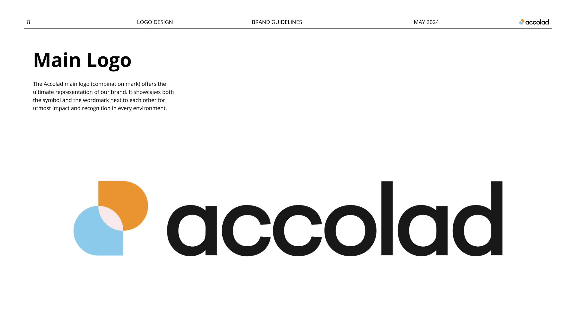
Identity + guidelines
A refined mark and a practical brand reference
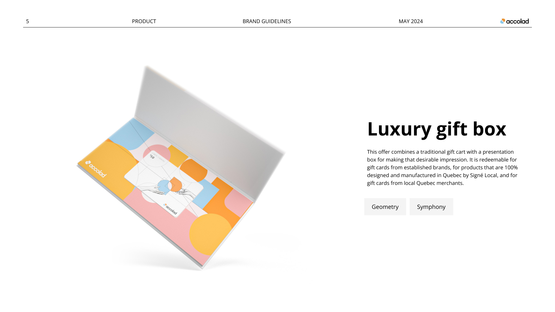
Packaging
Gift cards, boxes, sleeves and production artwork
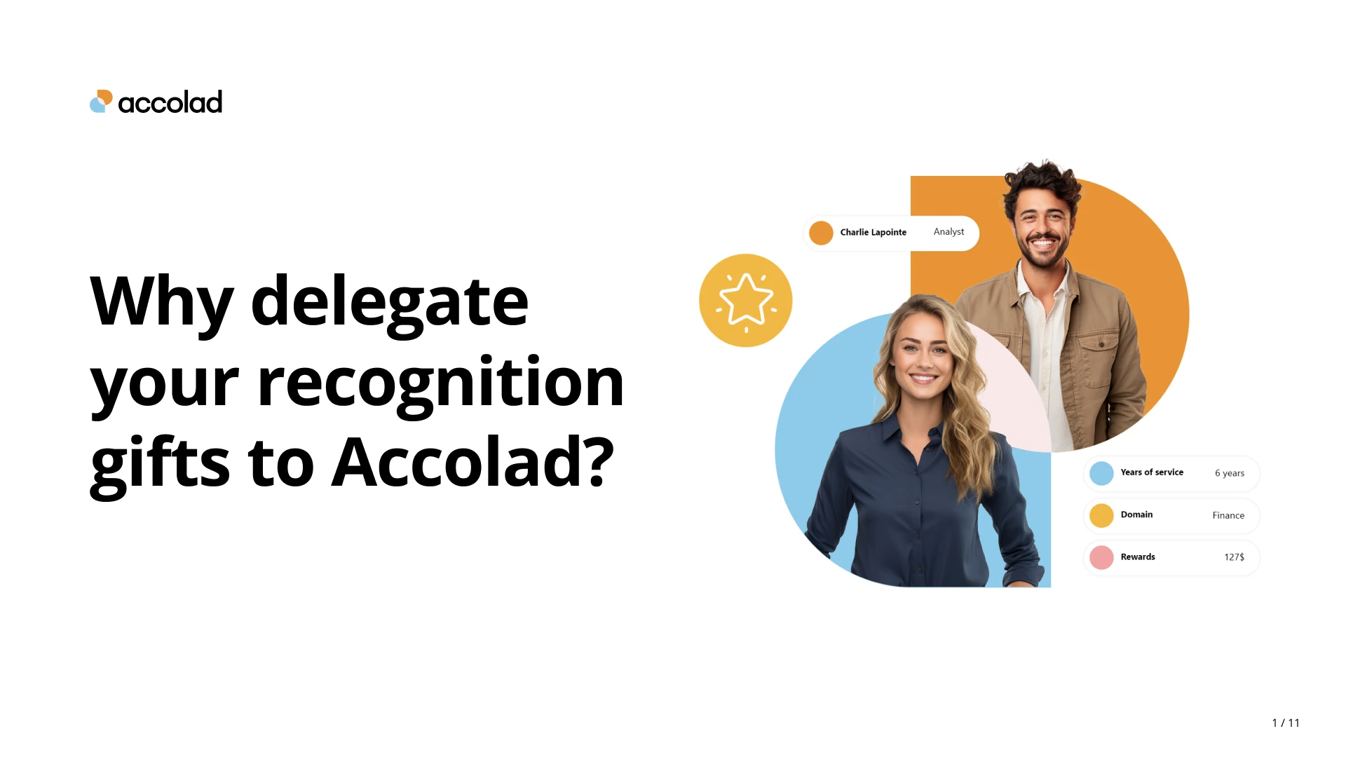
Marketing + sales
Recurring communications, campaigns and editorial design
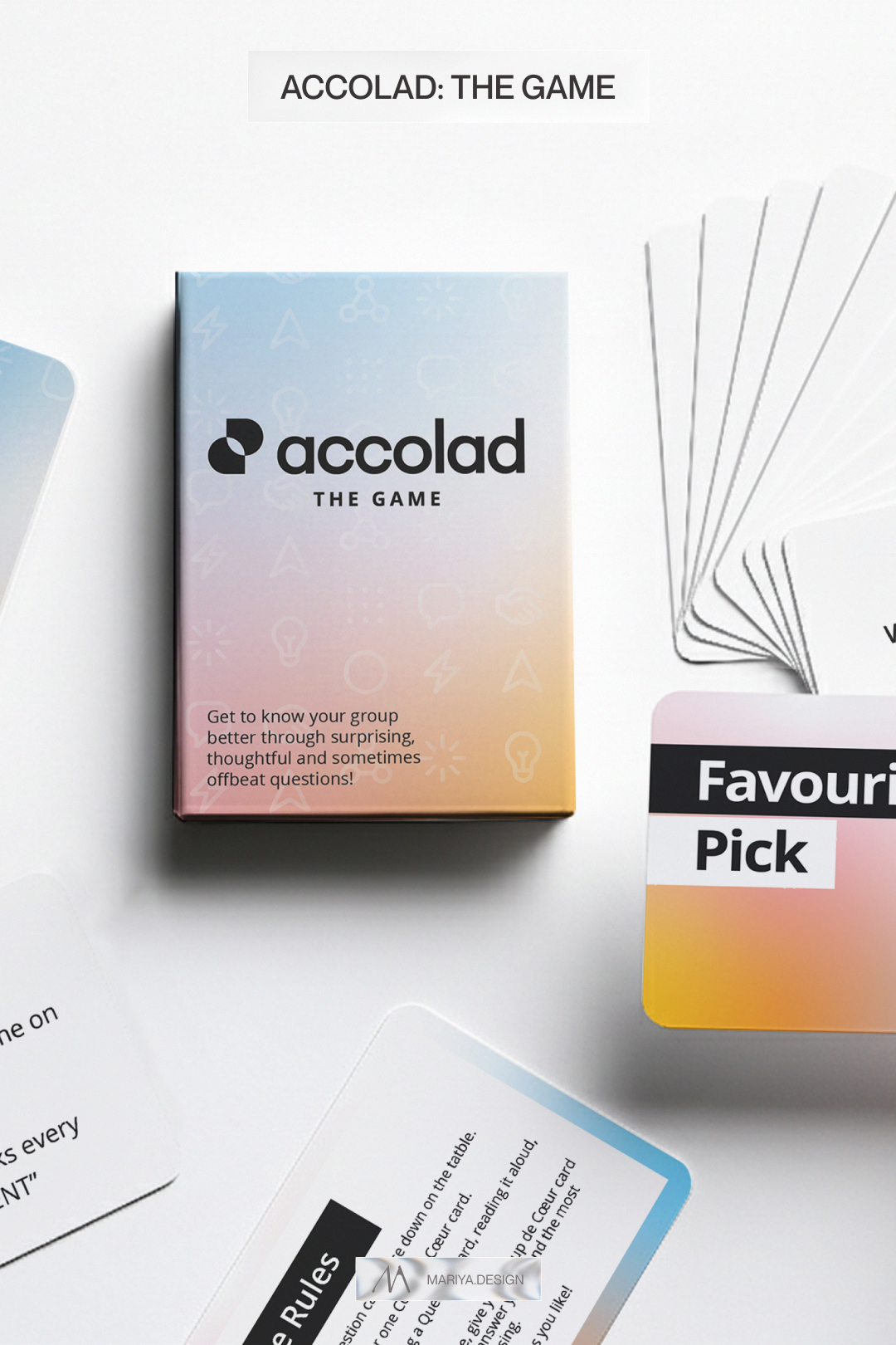
A new product
The Game · Packaging, cards and visual direction
From a logo concept and initial colors to a brand used across products, print, digital and events.
01 / A FOCUSED START
Keep the idea.
Build the expression.
Accolad came with a founder-made logo, blue and orange, and a clear need for gift packaging.
I refined the existing mark and developed the visual decisions needed to make it work in print: typography, color, illustration, hierarchy and composition. Those decisions became the starting point for the wider identity.
- Client
- Accolad · Employee recognition & rewards
- My role
- Brand design, packaging & ongoing applications
- Starting assets
- Founder’s logo concept + initial colors
- Relationship
- Two years · Starting in 2023
WHAT THE RELATIONSHIP COVERED
From the first brief
to the next application.
- Identity
- Logo refinement, typography, color, illustration and expanded guidelines.
- Physical gifting
- Gift cards, presentation boxes, sleeves, envelopes and inserts; mockups, dielines and production artwork.
- Digital
- Digital gift cards, self-service interfaces, website and landing-page design, icons and imagery.
- Communication
- LinkedIn and campaign graphics, sales materials, publications and event applications.
- Product extension
- The Game: visual direction, icon set, card hierarchy and packaging.
THE EXISTING LOGO, REFINED
A recognizable
starting point.
The original symbol stayed at the center of the identity. I rebuilt its geometry, cleaned the intersections and proportions, and clarified its relationship with the wordmark.
The blue and orange remained, with an extended palette and a more consistent visual language around them.
02 / PACKAGING DESIGN
Recognition,
made tangible.
Physical gift cards, sleeves and presentation boxes gave the identity its first real applications. Each format needed to feel connected while handling different proportions and production requirements.
The packaging work included mockups, dielines and production-ready artwork. The illustration and layout principles then carried into other printed and digital formats.
03 / THE BRAND IN EVERYDAY USE
One brief became
an ongoing relationship.
As Accolad developed, I continued applying the identity across self-service gift-card interfaces, website and landing-page designs, campaigns, LinkedIn, events and sales materials.
DESIGNED TO BE USED
A practical reference
for the next application.
The initial guidelines were short and focused on the first packaging need. They expanded as the business added new touchpoints, bringing logo use, typography, color, illustration, icons and imagery into a shared reference.
- Gift cards & presentation packaging
- Self-service UI & website design
- Campaigns & social graphics
- Events, sales & brand documentation
Selected scope / Website and interface design, brand applications and production artwork.
04 / A NEW PRODUCT · SUMMER 2025
The Game.
Its own personality.
A conversation-card product brought a different kind of brief: a distinct product expression that still belonged to Accolad.
I developed a softer gradient direction, a monochrome logo treatment, dedicated icons, card hierarchy and packaging. The established brand provided the foundation while the new product found its own voice.
WHAT THE WORK MADE POSSIBLE
A foundation for
what came next.
A focused packaging project became a consistent brand presence across physical products, digital experiences and recurring communication.
The value is visible in how the work continued: new formats and a new product could build on the same foundation, with design support as the needs changed.
THE CLIENT’S EXPERIENCE
“She has a unique ability to translate complex ideas into visually stunning designs that capture the essence of the brand.”
Yanik Guillemette · Accolad · Client feedback
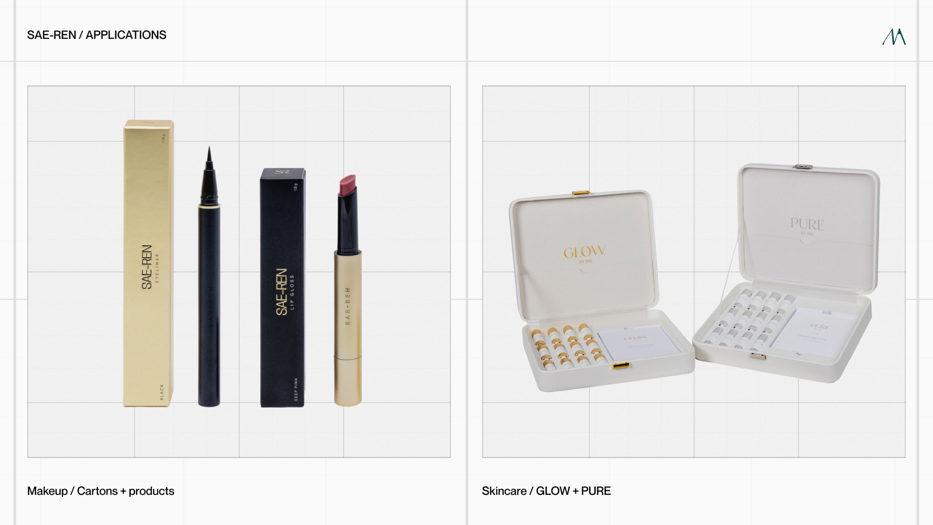
More work, in context.
View the work ↗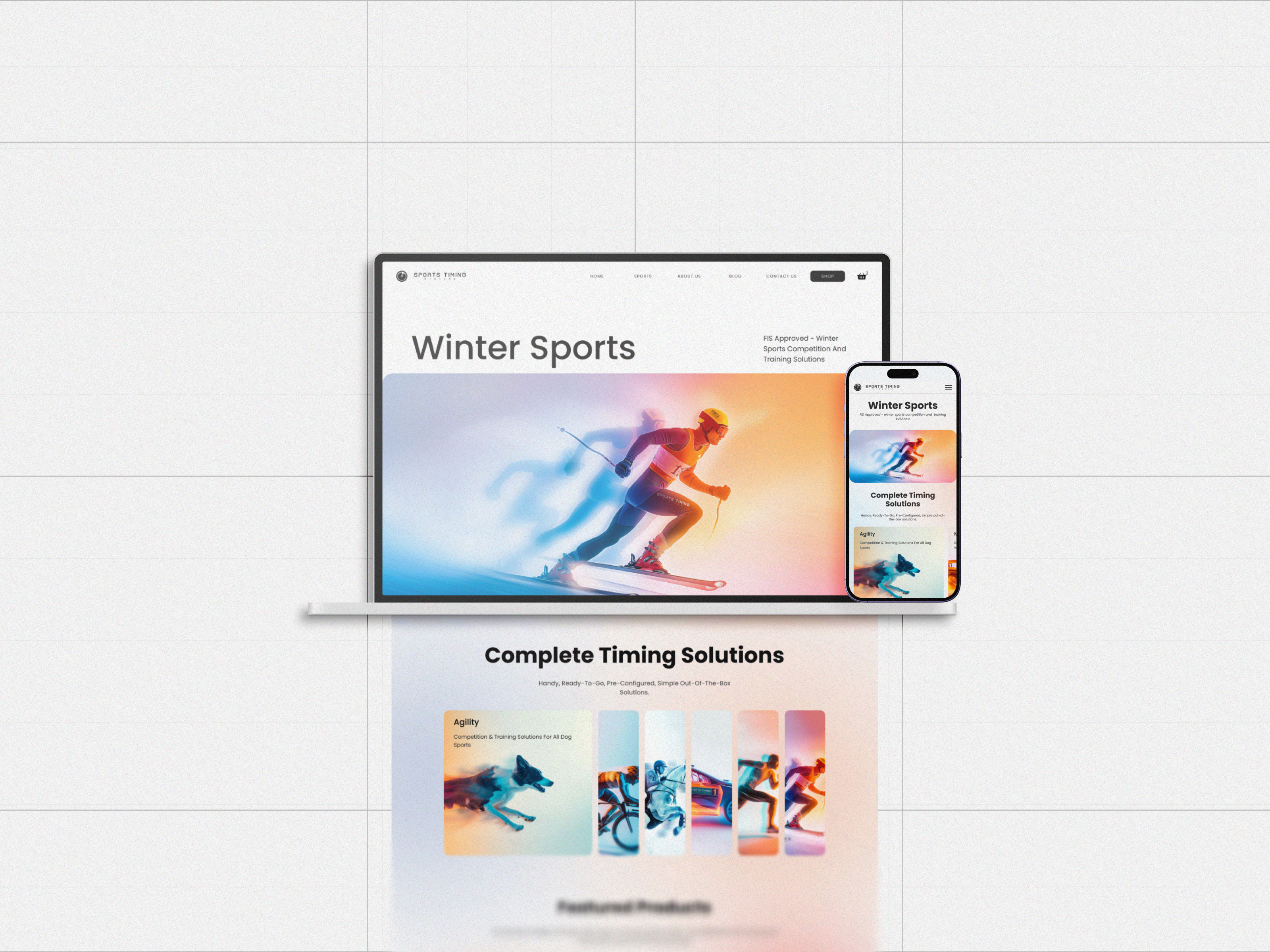
BRAND DESIGN + ONGOING SUPPORT
What’s next
for your brand?
A new identity, a considered evolution or the next application. Let’s start with what you need.
Discuss a project ↗